Development Log: From A Simple Design Idea To A Game
This is a little devlog, mostly for ourselves, so we can remember the process of creating this game easier. We won’t have much time in between all the projects we have, therefore we can only postpone the “postmortems” and “reviews” after we are done with everything. (I might edit more in the future)
19.01:
The team assembled and we talked about the hardware limitations of “Game and Watch” games.
We watched gameplay videos of “Game and Watch” games and played some copies online.
The next steps included figuring out what kind of game we would like to make and we had to choose between a “common” reaction-based game what was rather common for “Game and Watch” games (like “Game and Watch: Fire”), or we try to do something more unusual, similar to the game “Game and Watch: Bomb Sweeper”.
The game “Bomb Sweeper” sounded like “Minesweeper” and suddenly we had all sorts of ideas.
The idea of putting the cell information somehow into the cell (remember, “Game of Watch” games only use static sprites!): 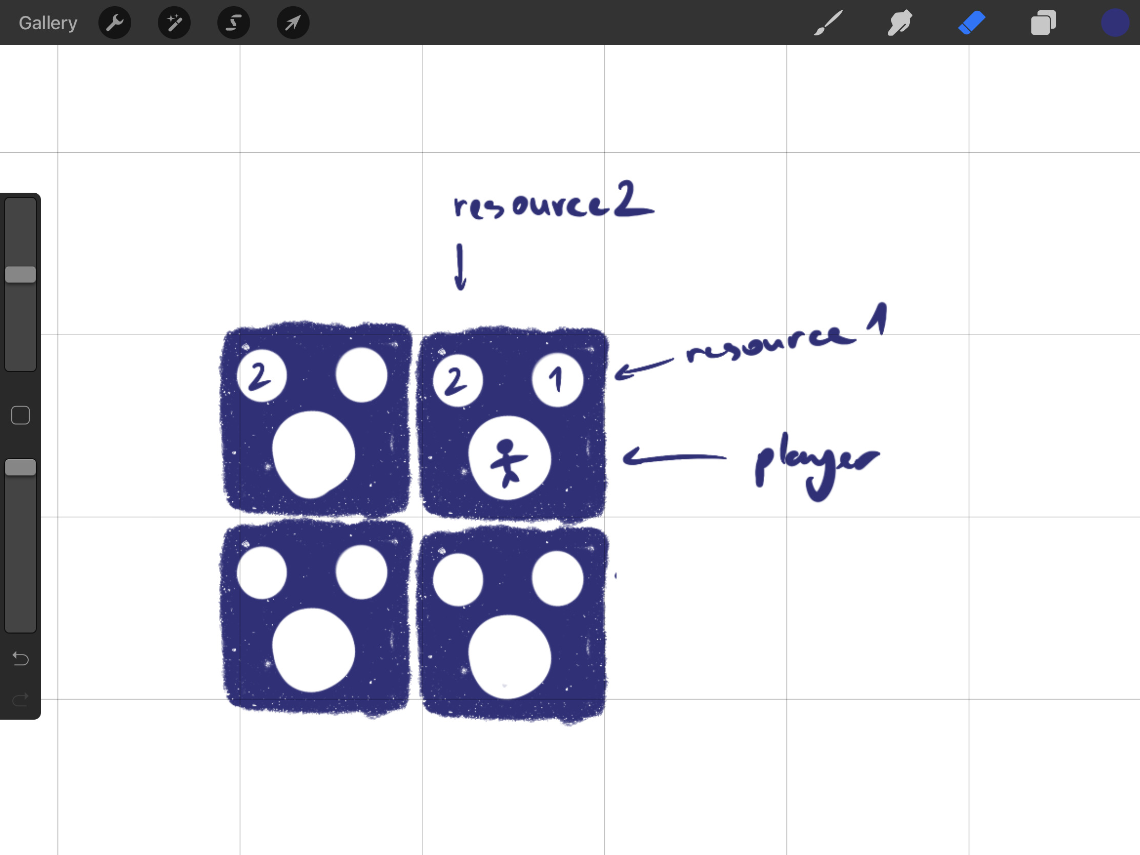
Our concept illustration of showing the fog of war and the idea of only counting tiles adjacent vertically and horizontally: 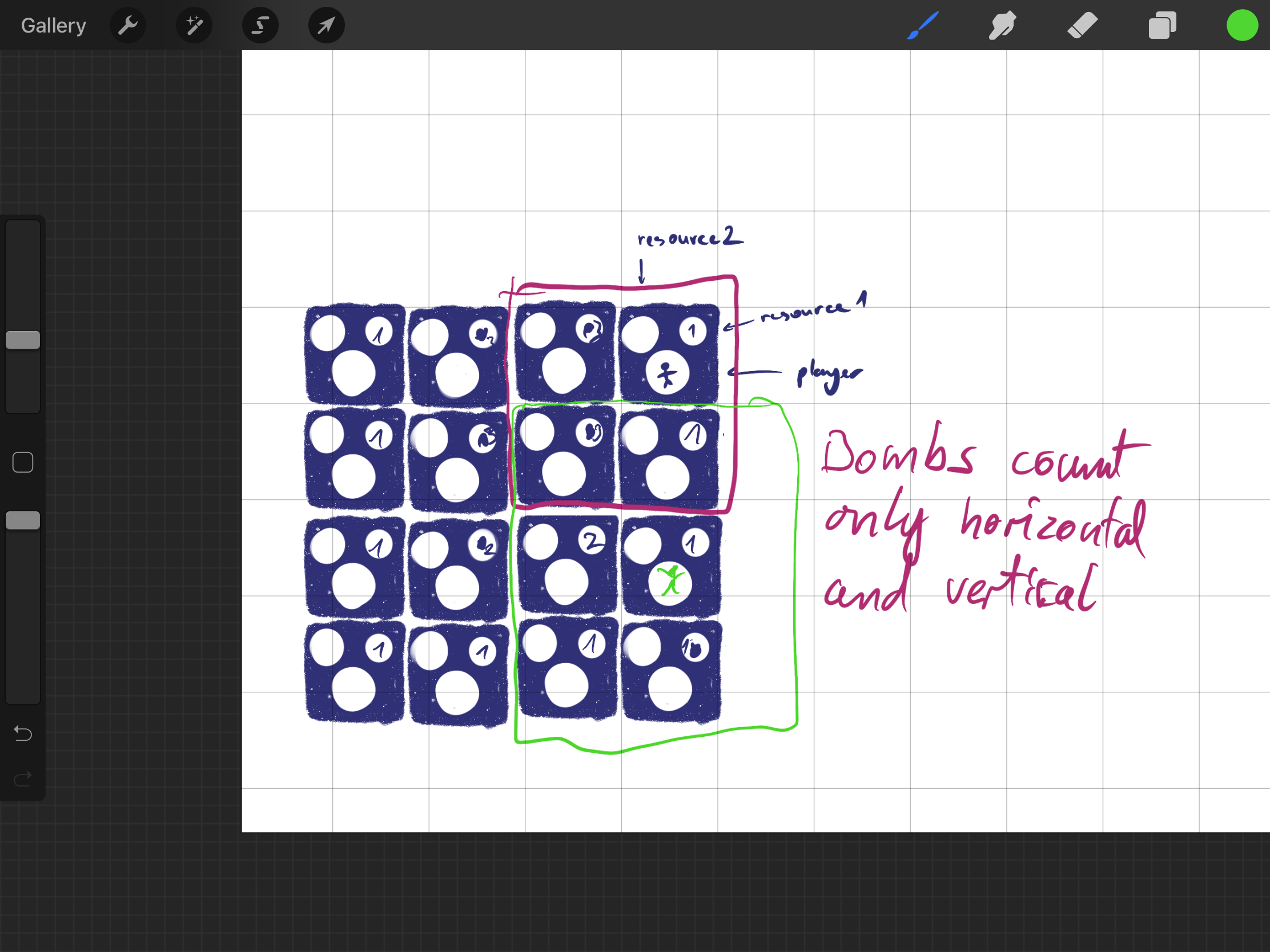
Right after discussing the design of our top-down minesweeper game, we also considered a “Plan B” -
A simple reaction-based game that takes influence from “Game and Watch: Octopus”: 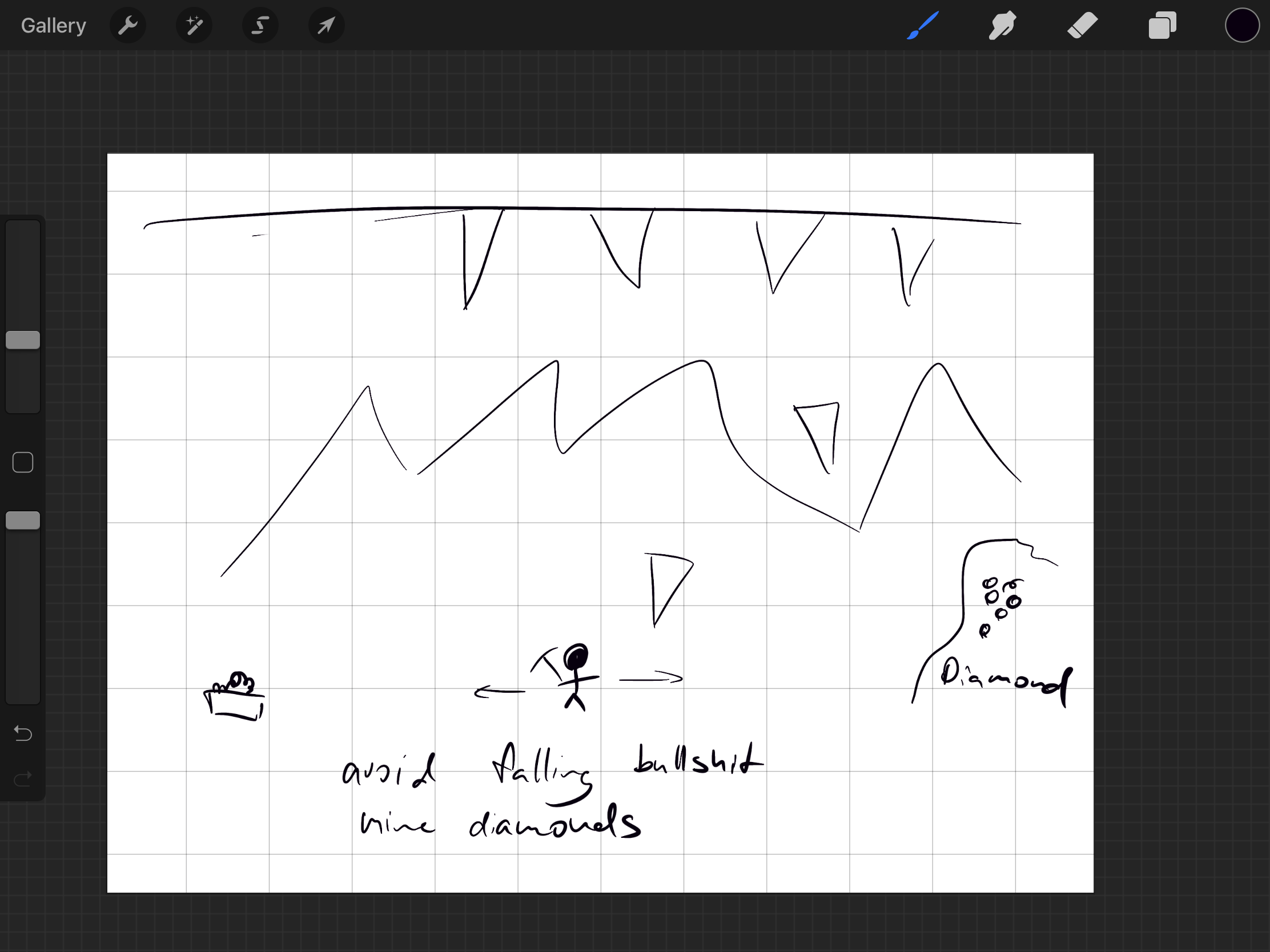
Even though we did not make the “Plan B” game, it still inspired us to approach animations similarly as in the “Game and Watch: Octopus” game.
20.01:
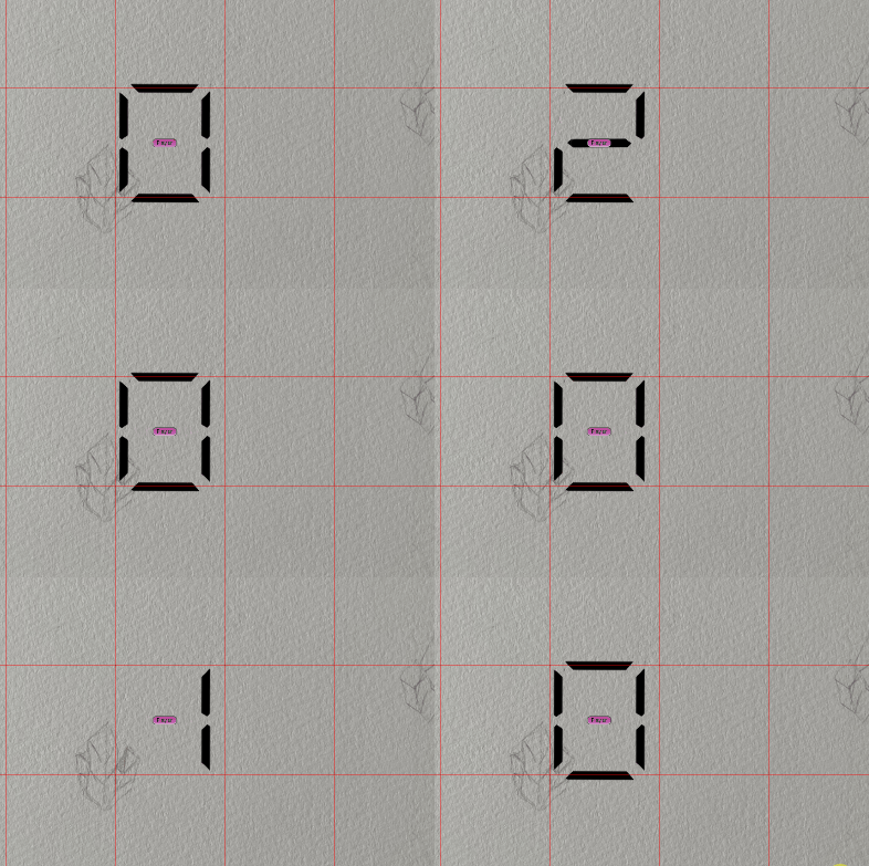
The next day included long conversations in discord, while we slowly worked on the game. I sketched out the architecture of the game, prepared Unity and tried to get the interface to let the player move like in “Game and Watch” games. The movement in “Game and Watch” games get “simulated” by turning the sprites on and off:
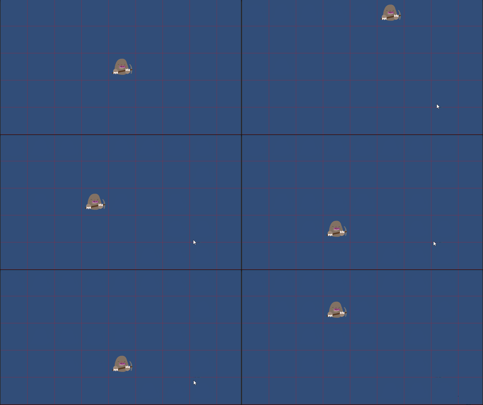 Additionally, numbers got slowly implemented to work the same as movement.
Every image exists beforehand, the “only” visual mechanic in this game is turning sprites on and off:
21.01:
The major addition to the game from this day is the implementation of a maze generation algorithm which utilises recursive division to draw an almost-perfect maze. It’s a very efficient algorithm and places the mines very nicely.
I decided to implement the generation of the mines early on because I did not want to deal with reading level data from anywhere or writing the levels by hand:
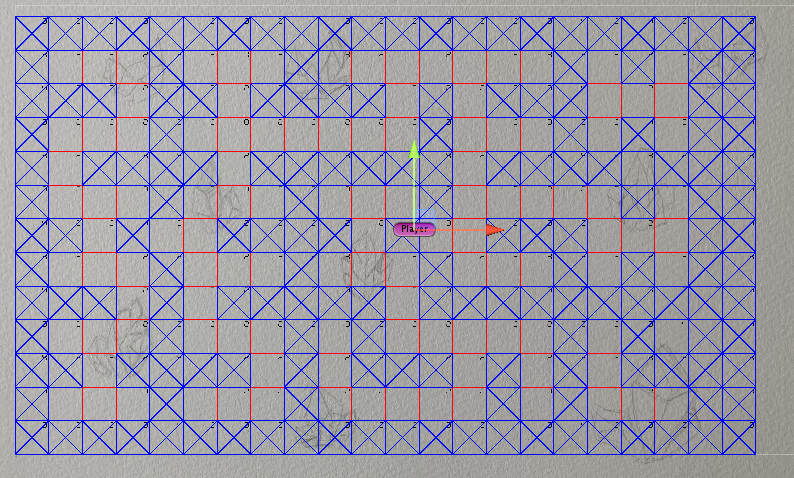
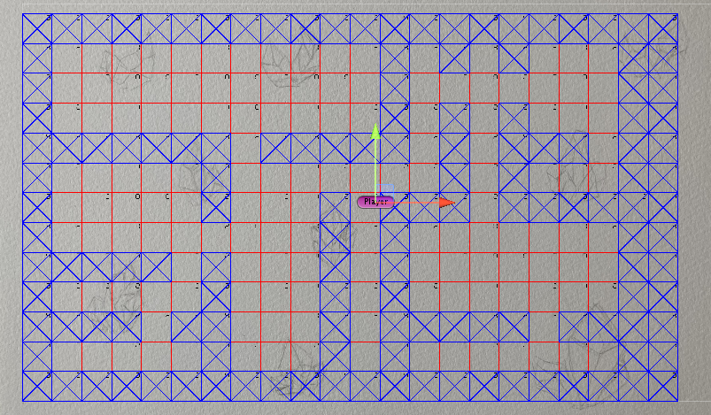 Additionally, the cells count the mines on themselves and the bombs on their adjacent tiles horizontally and vertically and they print the number correctly to the screen, like “illustrated” in the following screenshot:
 Lastly, I added options to format the playing field. Padding on the sides, how many rows and columns, etc. What allowed us to quickly adapt to changes:

22.01 - 24.01:
We took some time off and mostly worked a couple of hours per day since it was the weekend. We talked about music, sound and UI and tried to set on a couple of things. The UI’s layout is supposed to occupy about a third of the screen, while it is located on the right. Thereby, the game will be on the left and the playing field will be a square:
 Music and sound were in progress, we decided to give it a little adventure flare.
25.01:
During this day I received more polished art and implemented it right away. I implemented the player sprites, bombs, text, a new number font style, and the grid square separators:


The background received its next iteration including colour changes, different crystals, a goal post and the logo with the name:
 The background got overridden, the numbers got adjusted, the input handling for the movement got refined and I implemented a “multi-digit printer”, so we can display larger numbers.
This little algorithm tells every “segment”(a single digit) within a multi-digit number which digit it has to display. It calculates the correct power according to the position of the digit backwards, (We want to start with the highest and end with the lowest) therefore the power is equal to the count minus the current index minus one.
The rest is just finding out which digit to pass to the number and which value to use for the next number.
        const float base_number = 10.0f;
        var next = number;
        for (int i = 0; i < digit_count; i++)
        {
            int power = digit_count - i - 1;
            var divider = (int)Mathf.Pow(base_number, power);
            var use = next / divider;
            numbers[i].set((int)use);
            next = next % divider;
        }
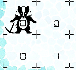
We also made a big design decision. We moved the mine counters from the top right of the cell, directly to the middle. Since our badger became transparent, we used this opportunity to display the number in his stomach. The user will subconsciously look more likely towards the badger instead of the top right of the cell, which makes it more comfortable to see the mine counters:
A simple score and a simple timer got implemented and both make use of multi-digit numbers and the background got adjusted to fit everything:
Moreover, I received a more polished square separator for the grid and implemented it in the game.
In the meantime of previously presented work, we discussed the bomb animation and how it shall be designed:

And as a final task for the day, I created the animation for losing/dying. The player blinks, the score gets decreased, the timer gets increased and lastly, the player gets put back to the spawn position.
During the evening I let my friends play the game to receive feedback for the gameplay. It’s confusing to new players, but simple when you figure it out.
26.01:
I worked with Kevin on the bombs and implemented the bomb animation and all the needed behaviour, as ticking and exploding. Whenever I waited for some art, I worked on the correct settings for the WebGL build. After some time, all the needed bomb behaviour plus its animation was finally done and I implemented the bomb animation in regards to the losing animation. The first bomb was a little simpler and less “popping” than our current one. We exchanged our thoughts and agreed to redesign the bomb a little by giving it a “stronger” explosion, but we postponed it to the next day. Just to get a little break from programming and dealing with Unity, I created some sounds with BXFR as placeholders and implemented them in the game. An explosion, moving, counting up the time, etc. Those things helped to communicate to the player what is happening. Based on the feedback, it gave the players a feel of responsiveness. (The fixed delta time of the game was 0.2 seconds at this point, but I changed it later to around 0.667 to make timers more accurate)
Sadly I forgot whether it was the 25th or 26th, but at one point I implemented a simple A* pathfinding algorithm to make sure that the player receives a solvable maze. If the player does not receive a solvable maze, the game generates a new one. It is still very unlikely that the maze generation messes up, but it was needed to prevent unfairness.
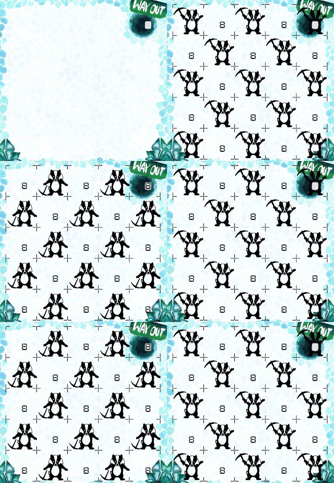
Lastly, I created an animation inspired by “Game and Watch” games. It’s the typical blinking of different areas on the screen. Due to feedback, I added a small start-up animation in which everything is lighted up (with some exceptions, I mostly focused on the playing field) followed by the “menu” animation, which is more typical for “Game and Watch” games:
27.01:
The bomb animation was finally done and worked wonderfully. It was a day mostly about polishing, including changing small things to polish the overall experience. Additionally, we added the feature to choose between “Game A” and “Game B”, because “Game and Watch” games typically had those. “Game A” refers to a normal difficulty and “Game B” refers to a harder difficulty. Usually, this difficulty increase gets enabled by increasing delta time to make the game faster, but we agreed on a more innovative difficulty increase by adding fog of war, which was part of the first design draft. We finally decided to add a hard-mode since playtests with friends suggested it. The other feature we added was to give the player the decision to decide how long a play-session should last.
Finally, the sounds got reworked almost entirely to make them overall more coherent with each other and the maze generation received a little love to make the mazes more distinct from each other.
Files
Timmy the Money Badger and the Glassmines
A Game and Watch Minesweeper Game!
| Status | Prototype |
| Authors | David Naußed, Ruthenium, pandorous |
| Genre | Puzzle |
| Tags | 2D, Arcade, game-and-watch, maze, Minesweeper |
Leave a comment
Log in with itch.io to leave a comment.